SBP026: OKRs (Objective Key Results) the Key to Performance Management? Part 2of 2

Roger Knocker • January 27, 2024

SBP026: OKRs (Objective Key Results) the Key to Performance Management? Part 2of 2

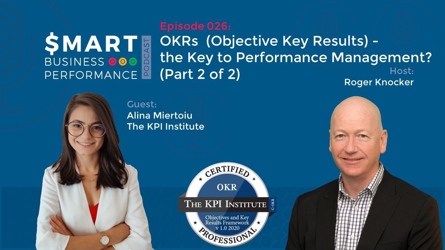
In this episode of the Smart Business Performance Podcast, Roger talks with Alina Miertoiu.
Alina is the OKR Product Manager and a Senior Management Consultant at The KPI Institute. She has a professional background in business research, process improvement and management consulting, being involved in international strategy and performance-related projects for clients from various industries, including IT, utilities, healthcare, venture capital, financial services and manufacturing.
Starting with the basics about OKRs, they end up giving some powerful tips and tricks on how you can use OKRs to boost your business.
Tune in now and make sure to take away the notes with you!
Conversation Highlights:

[01:10] A snap recap of the previous episode
  • OKR is a goal-setting framework for defining and tracking objectives and their outcomes.
  • The benefits of OKRs
  • Objective v/s Key Result
  • OKRs value purpose over performance.
  • OKRs are more suited for a very innovative and fast-changing environment. They work better in a structured organisation.

[03:03] Link it back to the vision and strategy
  • Settings up Individual OKRs
  • You need to have 3 to 5 objectives and key results to measure each one of them. Alina doesn’t recommend the OKRs to focus mainly on the numbers.
  • Try to set priorities rather than going for the numbers.
  • What about the big organisations?

[07:54] Why the OKRs are required to have aspirational goals?
  • If you are doing the same thing, you won’t get different results. Aspirational goals are the best way to know what we can do to have different results!
  • Make sure to give your employees a safety blanket.
  • What happens after you achieve your goal? How do you sustain your success?
  • Balance the hygiene metrics with future-focused OKRs

[14:16] Can OKRs and traditional KPIs co-exist?
  • With the OKRs, you are just trying to see what extra values and involvement they can bring.
  • Can everyone use individual OKRs?
  • If you want to have integrated OKRs, then you need to have approval.
  • A story to take a lesson from…..

[22:21] The Topic of Cadence
  • Is it a necessity to check your OKRs?
  • You will need to readjust the path in order to achieve your goals.
  • “A review doesn’t need to be a formal 3-hour long discussion as long as we have an informal short chat and we are in agreement.”
  • Where does the agile framework meet the OKRs?
  • A word of gratitude.
 
Special Reminder:
Check out the first episode with Alina and make sure to share your feedback with Alina

Connect with Alina:
On LinkedIn Email her at alina.miertoiu@kpiinstitute.com https://kpiinstitute.org/  
Where can we find out more information?
OKR whitepaper written by Alina Miertoiu from the KPI Institute
If you enjoyed this episode of the Smart Business Performance Podcast, then make sure to subscribe to our podcast.

By Clerissa Holm June 26, 2025
Financial Planning and Analysis (FP&A) refers to a core corporate function that drives informed decision-making through budgeting, forecasting, financial modelling, variance analysis, and performance management. Unlike general accounting, which focuses on historical transactions and compliance, FP&A plays a forward-looking and strategic role within organisations. It transforms financial data into actionable insights that guide corporate strategies. At its core, FP&A is concerned with understanding the financial implications of business activities. It creates visibility across departments, enabling leadership to align resources with organisational goals. While traditional accounting departments close the books and ensure compliance, FP&A teams are tasked with answering questions such as, "What will happen next quarter?" and "How can we reallocate capital to drive growth?"
By clerissa March 18, 2025
In the world of finance, numbers tell a story. However, that story is often buried beneath layers of spreadsheets and complex datasets. For financial professionals, the challenge is not just about understanding these numbers but also presenting them in a way that drives decision-making and inspires action. Enter data visualisation – the art of transforming data into clear, compelling visuals. Among the tools that have proven especially powerful are the line graph and the waterfall chart. These visuals help finance teams translate dry statistics into impactful narratives. In this article, we explore how these graphs can transform financial storytelling. The Importance of Data Visualisation in Finance Finance professionals are accustomed to handling vast amounts of data, from profit margins and revenue growth to expense tracking and risk assessments. Yet, presenting these figures effectively to stakeholders is a different ballgame. Visualisation simplifies this process, turning complex data sets into accessible insights. When done correctly, data visualisation: Enhances comprehension: Humans process visuals 60,000 times faster than text, making it easier for stakeholders to grasp key information quickly. Drives decision-making: Clear and compelling visuals help executives make informed decisions without wading through dense reports. Highlights trends and outliers: Visual tools can bring hidden trends and anomalies to light, prompting timely actions. Improves understanding and communication with business - Business doesn't always get what Finance is trying to communicate and good visualisations go a long way to bridging the gap. Better communication improves alignment to strategic financial goals. The line Graph: Unravelling Trends Over Time The line graph, also known as a stream graph or a stacked area graph, is a powerful tool for visualising changes in data over time. It is especially effective in showing how multiple categories contribute to an overall trend. In finance, line graphs can illustrate revenue streams, expense categories, or investment performance in a visually engaging manner. Use Case: Revenue Streams Analysis Imagine a financial report for a company with diverse revenue streams, such as product sales, services, and subscriptions. A line graph can display how each stream has evolved, highlighting peaks and troughs. The thickness of each ‘line’ represents the contribution of that revenue stream to the total, making it easy to spot which areas drive growth. Benefits of line Graphs: Trends Made Simple: Displays how multiple components evolve over time. Visual Impact: The fluid, organic design makes it easier to follow changes. Comparative Insight: Helps compare different categories intuitively. The Waterfall Chart: Bridging the Gap Between Figures Waterfall charts excel at breaking down the cumulative effect of sequential data points, making them ideal for financial analysis. They help bridge the gap between figures by showing how individual elements contribute to a total. Commonly used in profit and loss statements, budget analysis, and variance reports, these charts provide clarity in understanding how specific actions impact the bottom line. Use Case: Profit and Loss Analysis A financial analyst preparing a quarterly report might use a waterfall chart to demonstrate how various factors—like increased sales, higher marketing spend, and cost savings—impacted net profit. The chart’s structure, with its clear progression from starting figures to the final result, makes it easy for stakeholders to follow the financial narrative. Benefits of Waterfall Charts: Clarity: Simplifies complex financial data by showing individual contributions to total figures. Transparency: Clearly distinguishes between positive and negative impacts. Decision Support: Helps executives understand the key drivers of financial performance. Choosing the Right Visual for the Right Data Selecting the appropriate visual tool depends on the story you want to tell: Use line graphs for illustrating trends across multiple categories over time. Opt for waterfall charts when you need to detail the step-by-step impact of specific factors on an overall financial figure. By mastering these tools, finance professionals can enhance their storytelling, transforming raw data into insights that drive strategic decisions. Conclusion: From Data to Decisions The ability to visualise data effectively is a powerful advantage. The line graph and waterfall chart are more than just visual aids—they are essential tools for financial professionals looking to make data-driven decisions that resonate with stakeholders. By adopting these techniques, finance teams can turn numbers into narratives that not only inform but also inspire action. In the end, the power of finance lies not just in analysing data but in presenting it with impact.
More Posts