Your FP&Ai Insight Hub
Ai Automation Insights
Categories
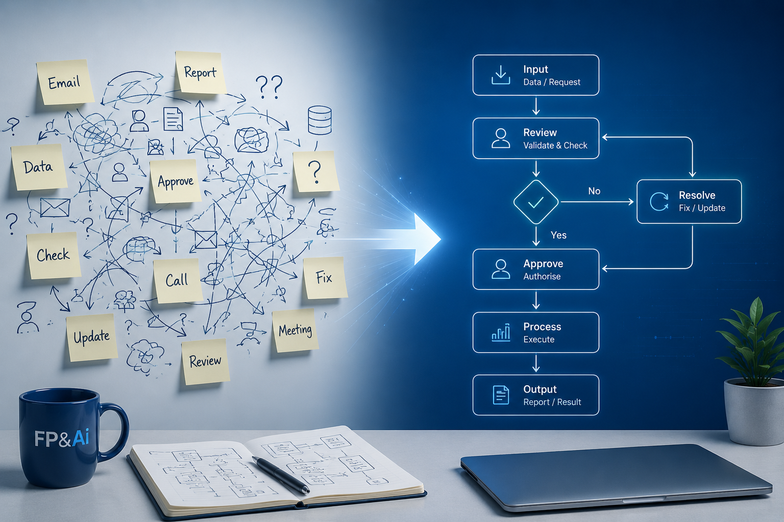
Before automating finance processes, map and understand workflows to avoid scaling inefficiencies and ensure meaningful results.

Discover how finance automation and real-time alerts improve decision making, reduce manual work, and help teams focus on what matters.

Learn how financial process automation improves finance team efficiency, reduces manual work, and drives better FP&A decision making.

Financial Process Automation helps finance teams reduce manual work, improve accuracy, and focus on strategic insights that drive better decisions.

Discover how structured reconciliations improve visibility, reduce risk, accelerate month-end close, and help finance teams work with greater confidence and less burnout.

Discover how the right mindset drives transformation in finance, from broomstick spreadsheets to AI powered insight. Embrace curiosity, elevate decision making, and lead the future of FP&A.

Discover 10 powerful ways AI is transforming finance, from automating reconciliations to improving forecasting, reporting, and delivering smarter business insight.

AI is not the threat. Stagnation is. Discover why finance leaders who embrace AI for faster insight and sharper strategy will shape the future.

Discover why finance reports must shift from data dumping to clear insight that drives action, using storytelling and purpose to lead real performance change.
Discover how simple visual storytelling can transform finance updates from dull reports into clear insight that drives action and helps people respond with confidence.
For more insight, listen to our podcast.
At FP&Ai, we believe finance is more than numbers, it’s about insight.