Your FP&Ai Insight Hub
Financial Reporting and Analysis Insights
Categories
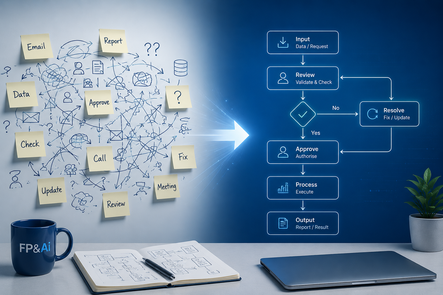
Before automating finance processes, map and understand workflows to avoid scaling inefficiencies and ensure meaningful results.

Activity-based costing reveals hidden costs below gross profit, helping finance teams understand true profitability and improve decision-making.

Discover how integrated business planning helps finance teams balance demand and supply, improve decisions, and protect margins.
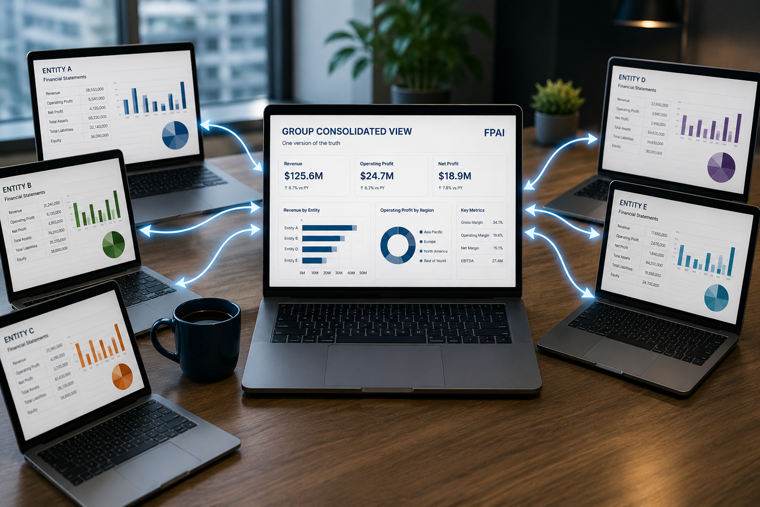
Consolidation software simplifies multi-entity reporting by integrating data, automating processes, and creating a single source of truth.

Explore how activity-based costing improves financial insights, reveals true profitability, and helps businesses make smarter decisions.
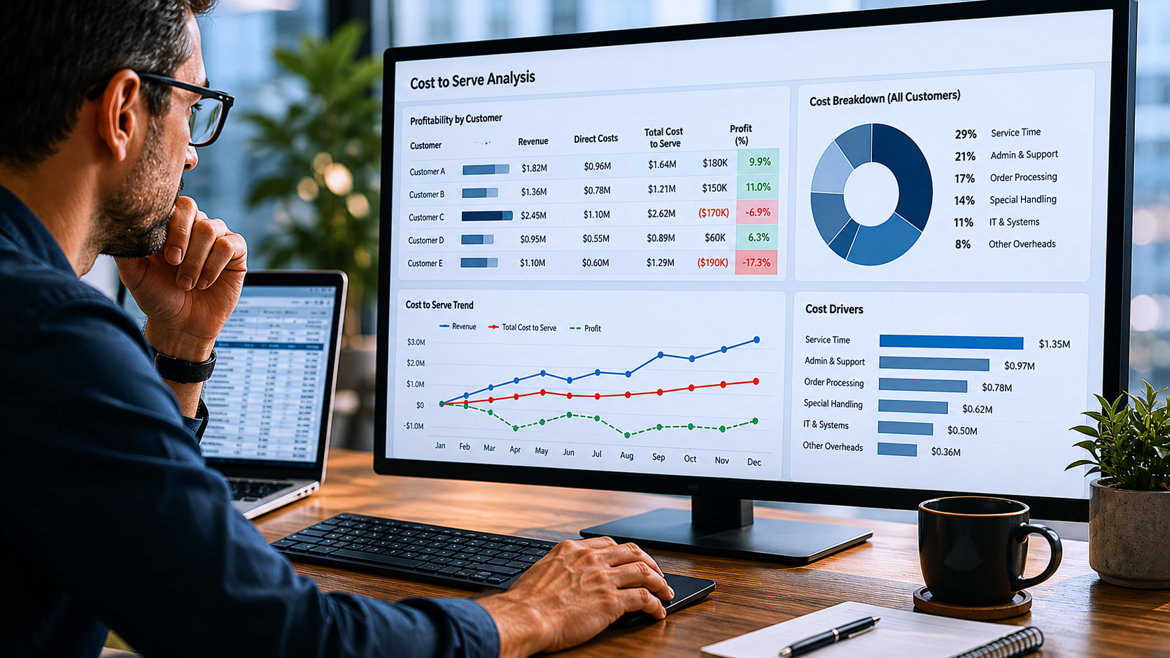
Activity-based costing reveals true cost to serve, helping finance teams uncover hidden losses, improve pricing, and drive better decisions.

Discover how finance automation and real-time alerts improve decision making, reduce manual work, and help teams focus on what matters.

Learn how integrated business planning and driver-based models improve financial planning accuracy, alignment, and decision making.
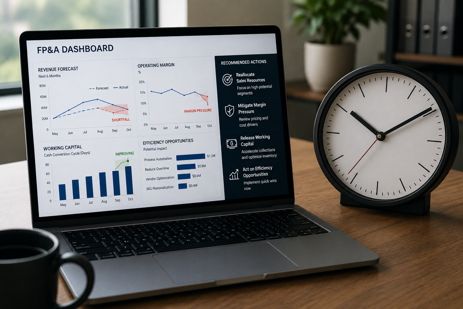
Learn how FP&A closes the gap between insight and action with real-time data, faster decisions, and forward-looking financial planning.

Strong balance sheet reconciliations improve financial accuracy, reduce risk, and support better decisions with finance automation.
For more insight, listen to our podcast.
At FP&Ai, we believe finance is more than numbers, it’s about insight.