SBP030: 5 Procurement Tips to move the needle
Roger Knocker • January 31, 2024
SBP030: 5 Procurement Tips to move the needle
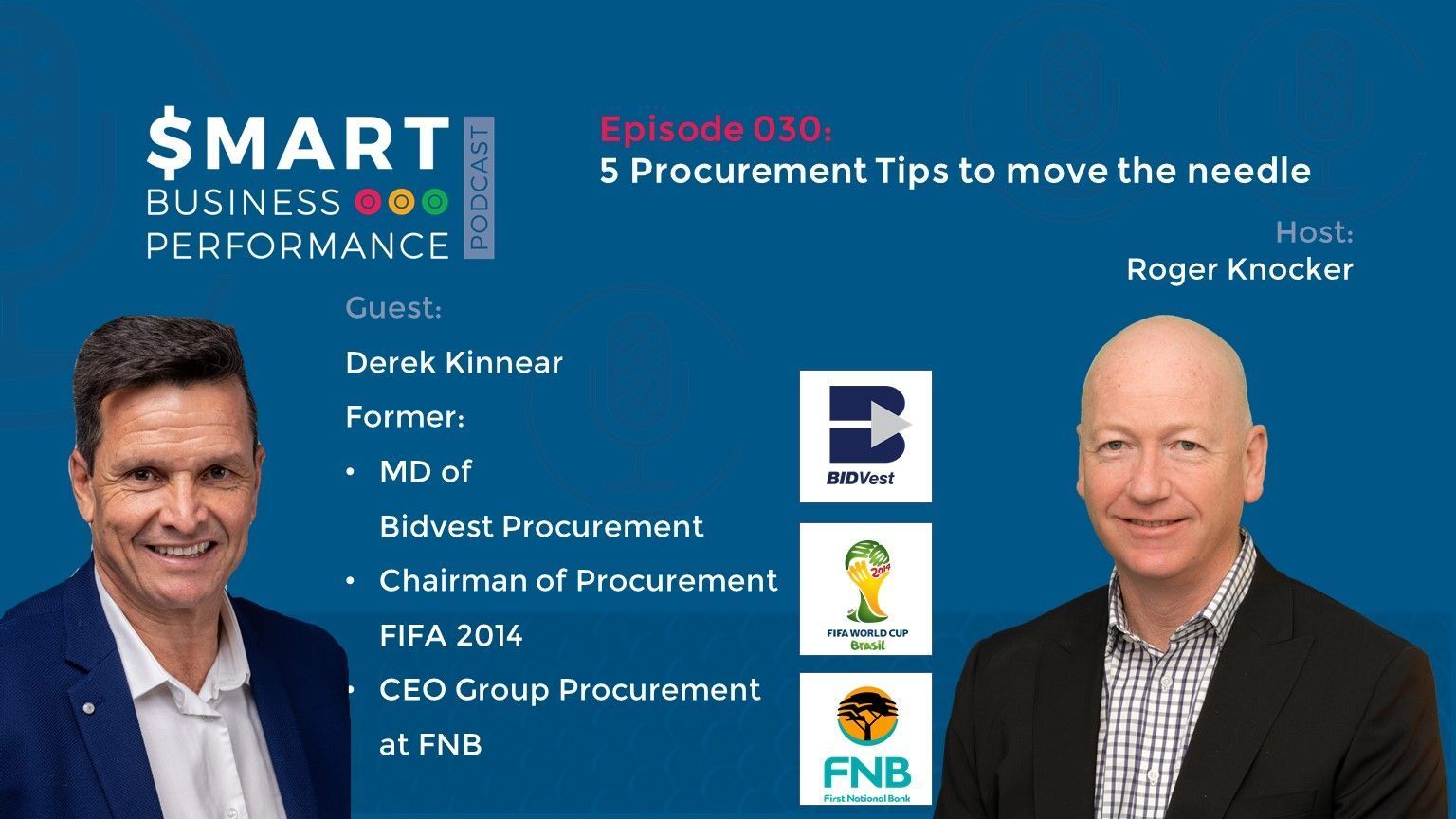
In this episode of the Smart Business Performance Podcast, Roger welcomes Derek Kinnear and discusses the 5 Procurement Tips to move the bottom-line needle. This episode will boost your Business procurement to a whole new level!
Derek is the former Managing Director of Bidvest Group Procurement since 2009.
He was the Chairman managing the procurement of the 2013 FIFA Confederations Cup and the FIFA 2014 Brazilian Football World Cup.
Prior to that, he was the CEO of Group Procurement at FNB (First National Bank) and a Financial Services Charter Committee Member.
Tune in now and make sure to take away the notes with you!
5 Procurement Tips to move the needle are:
[01:01] Derek thinks that the World Cup experience was interesting. He thought of using most of the procurement process as the base of the 2014 World Cup. He joined Bidvest in 2009 and prioritised providing a great experience to everyone.
[05:40] Derek thinks that the easiest onset to get the cohesion going was with difficulty. A lot of the emphasis throughout the process was driven from a financial perspective.
[09:36] He explains his approach towards procurements in that environment.
[12:33] He unfolds the 5 Procurement Tips to move the bottom-line needle and elucidates the first procurement tip with the help of some intriguing examples.
[22:35] He further emphasize the need to pursue initiatives significantly higher than the CPI rate while clarifying the basic principle of 80-20 (Pareto Principle).
[30:06] You need people at a lower level. The only way you will translate that kind of financial result is through Key Performance Indicators (KPIs) that drive the Executives as well as operational people.
[38:38] If you’re chasing only one criterion, and that’s the price, then you will be doing yourself an injustice and you are going to do the organisation a massive injustice.
[50:45] Derek explains that if you can put all the above tips together, it could be the best-kept secret in the world. What you must do is to communicate!
About Our Sponsor:
KPI Management Solutions helps organisations to meet their Stretch Goals using KPIs, OKRs, AI-enabled Technology and Training. KPI offers advanced data-driven Procurement Performance services in association with Derek Kinnear.
Download the KPI Spreadsheet for FREE for a limited time only.
Connect with Derek: Info@nxttxn.com Ring him up at +27 83 327 0001
If you enjoyed this episode of the Smart Business Performance Podcast, then make sure to subscribe to our podcast.
Derek is the former Managing Director of Bidvest Group Procurement since 2009.
He was the Chairman managing the procurement of the 2013 FIFA Confederations Cup and the FIFA 2014 Brazilian Football World Cup.
Prior to that, he was the CEO of Group Procurement at FNB (First National Bank) and a Financial Services Charter Committee Member.
Tune in now and make sure to take away the notes with you!
5 Procurement Tips to move the needle are:
- Run Procurement as a profit centre.
- If savings is the mandate: then the initiatives must exceed CPI.
- Monitor KPI’s, using clean data.
- Ensure you adopt collaborative programs and relationships with your Partners / Suppliers.
- Communicate regularly with your Target audience (internal and external stakeholders).
Conversation Highlights:
[01:01] Derek thinks that the World Cup experience was interesting. He thought of using most of the procurement process as the base of the 2014 World Cup. He joined Bidvest in 2009 and prioritised providing a great experience to everyone.
[05:40] Derek thinks that the easiest onset to get the cohesion going was with difficulty. A lot of the emphasis throughout the process was driven from a financial perspective.
[09:36] He explains his approach towards procurements in that environment.
[12:33] He unfolds the 5 Procurement Tips to move the bottom-line needle and elucidates the first procurement tip with the help of some intriguing examples.
[22:35] He further emphasize the need to pursue initiatives significantly higher than the CPI rate while clarifying the basic principle of 80-20 (Pareto Principle).
[30:06] You need people at a lower level. The only way you will translate that kind of financial result is through Key Performance Indicators (KPIs) that drive the Executives as well as operational people.
[38:38] If you’re chasing only one criterion, and that’s the price, then you will be doing yourself an injustice and you are going to do the organisation a massive injustice.
[50:45] Derek explains that if you can put all the above tips together, it could be the best-kept secret in the world. What you must do is to communicate!
About Our Sponsor:
KPI Management Solutions helps organisations to meet their Stretch Goals using KPIs, OKRs, AI-enabled Technology and Training. KPI offers advanced data-driven Procurement Performance services in association with Derek Kinnear.
Download the KPI Spreadsheet for FREE for a limited time only.
Connect with Derek: Info@nxttxn.com Ring him up at +27 83 327 0001
If you enjoyed this episode of the Smart Business Performance Podcast, then make sure to subscribe to our podcast.

Before automating finance processes, map and understand workflows to avoid scaling inefficiencies and ensure meaningful results.

Activity-based costing reveals hidden costs below gross profit, helping finance teams understand true profitability and improve decision-making.