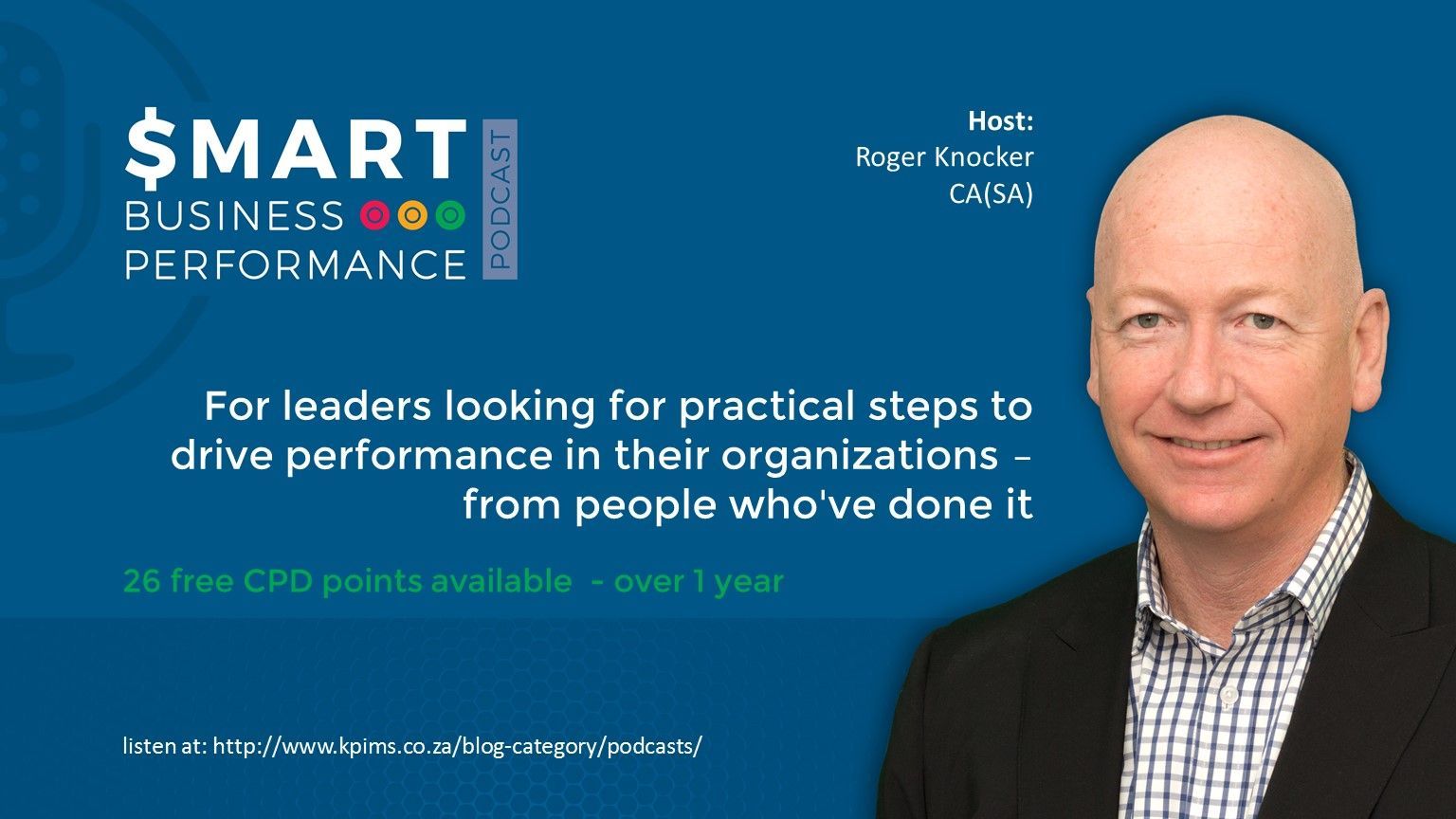
SBP000 Smart Business Performance Podcast: Start here for an Overview
Roger Knocker • December 21, 2023
SBP000 Smart Business Performance Podcast: Start here for an Overview
Overview:
Roger interviews business leaders and unpacks the successes they have achieved using the 5Ps:
- Purpose/Planning
- Performance
- People
- Processes & systems
- Projects
It goes beyond the business results and reveals some of the secrets that led to their success. The podcast is filled with insights and tips that you can easily replicate in your own organization.
How the free CPD points work:
- Many professions allow their members to listen to podcasts and claim the time for CPD points. (NB You will need to confirm eligibility of these hours your own professional body – each body has their own rules).
- There must however be evidence of this. We have 2 steps to complete which will enable us to verify that you have listened to the podcast:
2. Each episode has a 4 question quiz and the questions are very simple provided you have listened to the podcast. The questions are not intellectual and you wont be able to guess them, but if you have listened to the podcast, you will find them very easy to answer. If you don’t achieve 75% for the quiz you can retake it until you do. You will immediately get an email with the score which you can keep for your own records.
- In addition to the above documents being emailed to you, we will send out a transcript of all the assessments you have successfully completed which you can submit to your professional body as independent verification.
These are some of the topics planned for the future Podcasts:
1. Purpose and Planning
- Do strategic planning
- Document a strategic plan
- Define a mission statement
- Define a vision statement
- Set stretch targets that are still reasonable
- Integrate your planning across all functions
- Reduce the budget cycle time
- Improve the accuracy of sales forecasts
- Create more relevant costing models
- Improve Revenue planning
- Do Capex planning
- Know what tools can assist with business strategy
2. Performance (Including Data Analytics)
- Identifying the right KPIs for your:
- Business
- People
- Processes
- What to do with KPIs not in a system?
- Automating more KPIs
- What Dashboard tools are out there?
- What BI tools are low cost or free?
- Automating Reports and Analysis
- How to reduce costs in your business without breaking it
- How to get on top of Working Capital
- What is Customer Experience and what value does it add?
3. People Performance
- How to Recruiting smarter
- How to remunerate to enhance performance,
- Methods for Improving the Sales force effectiveness
- How to train to impact performance
- How to make the most of appraisals
- Developing the right capability deliver on the business strategy
- What is the Evolving Role of the Strategic CFO?
4. Process & Systems Optimization
- Where to prioritize your business optimisation efforts,
- How to document your processes,
- How to measure business processes,
- Identifying operational risks,
- How to improve financial controls
- How to monitor Processes and Financial Controls continuously
- Improving Master Data
- How to choose an ERP system
- When do I need to upgrade my ERP system?
- How to quantify the benefits of a new ERP system or more modules of an existing one.
5. Project & Initiatives
- What simple tools are there for managing projects?
- Key skills for non Professional Project Managers to Master
- How to budget for Projects
If there are topics which you would like covered, please add them here

Before automating finance processes, map and understand workflows to avoid scaling inefficiencies and ensure meaningful results.

Activity-based costing reveals hidden costs below gross profit, helping finance teams understand true profitability and improve decision-making.